

Presentation
Reply

I began to think about corporate style and merchandising: image, logo, advertising, packaging, etc and how exclusive designer labels, like Louis Vuitton, make a simple statement in a subtle way with repeating logos. Also, howexclusive designs are boxed and items protected with acid free tissue for protection. This led me to the idea of printing my design on tissue paper. Also, I then considered the subtly of the image on a delicate material. Although, black and white contrast each other will on my bag I felt this was too harsh for the fine tissue paper which is why I decided to print it in grey instead. This kept the design subtle and sophisticated.
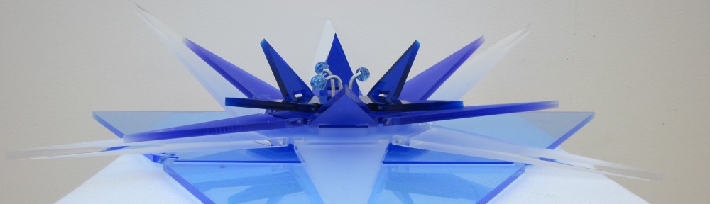
I moved away from the cube concept for display and into packaging. Had there been a little more time, I would have made a template for the Tecton Design ambigram to be embossed on the box lid. Again I feel ‘less is more’, as the complexity of the design is benefited by the simplicity of ‘white on white’ embossing or grayscale printing. It draws the eye without being garish. It has a classy feel but fresh, fun and different with the optical imagery of the ambigram.

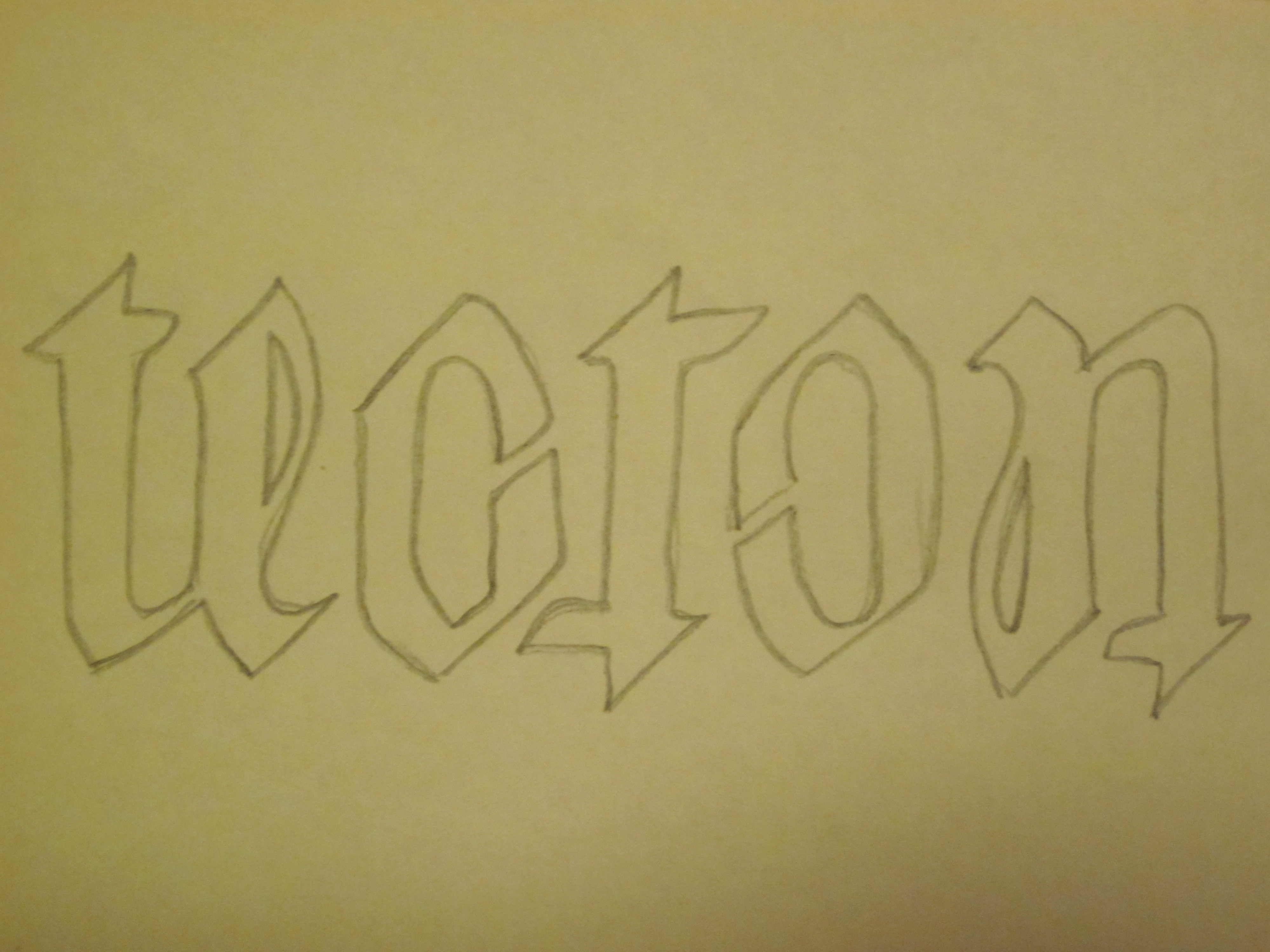


Through further investigation into my idea I began to design my own fonts for the 3D letters made from cubes. I then explored the idea of smaller cubes as ‘tokens’ for the client to collect with purchases. These could also work as fridge magnet squares or cubes as they would be less untidy. Thinking of the cubes or magnets being moved or tumbling over, led me to considering reading the letters upside down and maybe the potential for an ambigram. This could be a feature specific to the brand and different ranges in the future, giving me the idea of a corporate identity concept, which I liked.
In order to help promote my bag I am going to produce a printed outcome that encompasses the products brand name: Tecton. I began by exploring into Visual Merchandising which led to my Initial Design of a window display.

The design is of a group of large-scale letters spelling out the word TECTON. Each letter is built up from a selection of cubes, each printed with a series of still images from the promotional bag advert. I chose to construct each letter out of cubes as this not only mimics the obvious connection between the squares featured on the design of the bag but also ‘building blocks’ suggest an architectural structure which references the architectural influence.
I have explored many possibilities for potential music to feature in my advertisement. Unfortunately, I was unable to find the right piece of music that perfectly matched the way I envisaged my advert to sound, so I collaborated with a composer in order to produce a piece of music that encapsulated my desired effect.
Within the given timescale, I was unable to get an appropriate person to model for my video, which meant my only other option was to model for it myself. I planned out each camera shot, I wanted in my advertisement, in order to give it a slight narrative and then set up the camera for each different shot. I collected a vast amount of footage to give myself a large number of shots to choose between, when editing. After much deliberation, I gradually edited my footage down to a short video, between 30 seconds to a minute long. I chose to produce a short video as I was creating an advert which meant it needed to be direct and to the point.
